Some of you might remember the post I did on my current art stash here. Well, since I've been using this set for a few years I'd like to do a review of it. I'm by no means endorsed by or getting anything from Winsor & Newton.
From my previous post:
“Colors in this set: lemon yellow hue, cadmium yellow hue, cadmium red pale hue, cadmium red hue, alizarin crimson hue, purple lake, ultramarine, cerulean blue hue, viridian hue, sap green, yellow ochre, burnt sienna, burn umber, & Chinese white. I’m not very happy with the burnt umber. I use it to make blacks, grays, & shadows (along with ultramarine). I’ve found that it has a gritty, chalky texture. I think I’ll be swapping it for sepia or Vandyke brown. I may also get an intense phthalo blue or indigo to create better shadows. Someday I’ll upgrade completely to higher quality paints...”
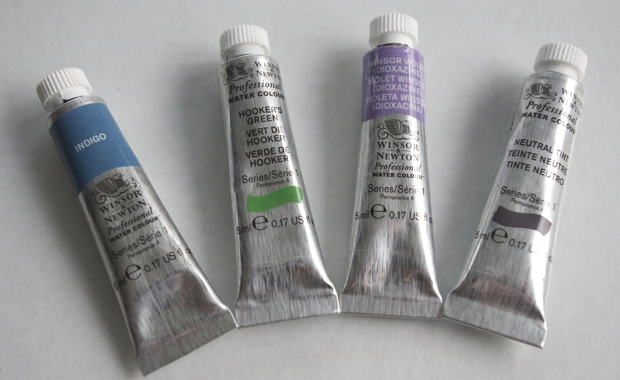
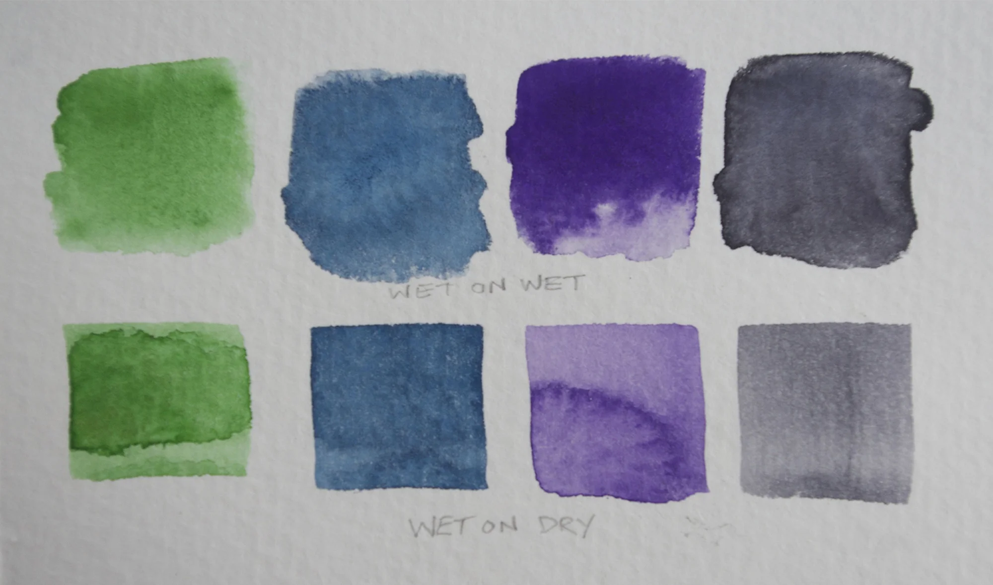
At the time of that post I had added a W&N Cotman permanent rose & a W&N Designer's Gouache permanent white. I have since added W&N Professional neutral tint (gray), Winsor (dioxazine) Violet, indigo, and Hooker's Green. I am also still looking for a good primary red.
I didn't talk at all about the set in regards to what I feel are its strengths & weaknesses.
Up front, it's a good little starter set. It's quite inexpensive & most likely available your local art supply store. For that, it's wonderful. They have a warm and a cool of yellow, red, blue, green, and brown, plus some extra colors. The pans take you back to childhood playing with Crayola watercolors. It's very easy to work with being in the pans. Everything's in one place. You just need water & you're good to go. It's super portable and storable. So, that's all great. The more accessible art is, the better, I feel.
The set also tends toward being gritty. It's especially noticeable in the lemon yellow and, as noted above, burnt umber. I've learned using this set (after upgrading from a super shitty Reeve's set-learn from my mistake, never buy Reeve's) that you really should buy the very best you can afford, not just what you can afford. I've supplemented this set with the professional level W&N watercolors and it's a world of difference. I wish I'd bought the professional paints from the get-go. Even if I had to buy them one at a time as I could. When you have good tools and materials you enjoy painting more. It just feels better. I feel like I've made leaps & bounds improvements since upgrading my materials since college. I really should have listened to my professors when they said to buy the best...
That being said, I think there are some improvements that could be made to this set and some other things that I've learned.
If I was going to revamp this set here's what I'd do:
1. Toss that white right out. It's totally useless for anything besides making your colors dull and cloudy.
2. Remove that ridiculous little water dish. It's super cute, but you could rinse your brush maybe once. Twice tops. Maybe put a little thumb grippy might be a nice addition.
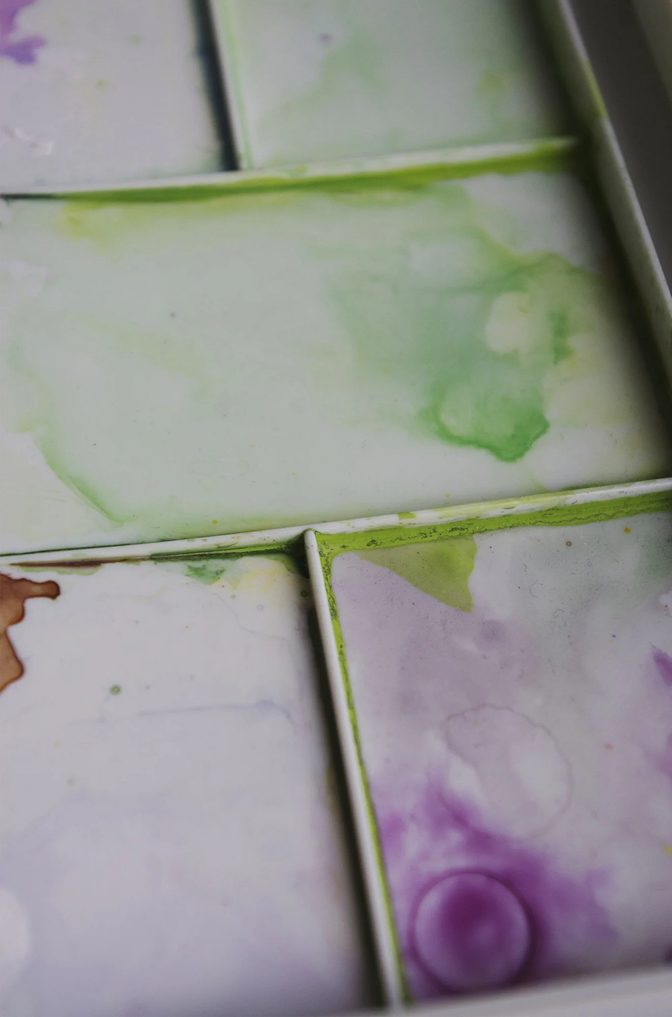
3. Take the dividing bars on the lid/palettes out. I used the lid a handful of times, but the water leaks between the spaces, so your colors get muddied pretty quickly. Leaving it open would still leave you able to use the lid as a palette, but it would be easier to clean. Same goes for the bottom palette which slides out (I've literally never used it).
4. Swap Purple Lake for dioxazine violet. Dioxazine violet is what I would call a "true purple" and would create move variety in the set than Purple Lake, which is very close to alizarin crimson hue.
5. Speaking of colors that are very close...the cadmium red pale hue and cadmium red hue are nearly indistinguishable. I would keep the cadmium red pale hue, but bring a cadmium red dark hue in to replace the other. It's more of a primary red.
6. Swap viridian for a Hooker's Green. I'm very frustrated with the original selections for green. I used the viridian a handful of times, but it's so blue that it's really not useful for my subjects. If I needed a similar color I could easily mix one with Hooker's Green and ultramarine.
7. The only hole left in the set then would be where the Chinese white was. I would put a Payne's Gray in it's place.
For those of you interested in watercolor comparisons, check out this series of blog posts by artist Jane Blundell. I highly recommend giving them a read. There's a lot of information and beautiful photos of mixing charts.
For your edification, here's W&N's Cotman color list.


