A friend recently asked for my suggestions for beginner watercolor supplies, so I thought I'd turn it into a blog post and spread it around to help make the shopping process easier. There are so many amazing products out there that it can be really daunting to make the "right" choices. There aren't many wrong choices, really, it mostly comes down to preference. That's something you'll get to discover for yourself, too! Without further ado, here is what I would buy you if I was going to gift you a beginner's painting set...
Read MoreReview: Four Different 90# Watercolor Papers—Saunders Waterford, Canson, Bienfang
I bought four different 90 pound sheets of 22 by 30 inch watercolor paper from Blick. I’m testing them to figure out which would be the best option for my upcoming graphic novel, Wild Dogs. While I was doing it, I thought I might as well do a little review.
Read MoreI Love My Day Job
I feel like artists don’t talk much about their day jobs. Or if they do it’s usually negative. I work a day job that I love!
Some artists’ day jobs are adjacent to their passion, but mine’s not in my field at all. That’s actually why I applied for it originally, almost three years ago. I wanted something I could do that would pay my bills, but I wouldn’t “bring home” with me or be expending creative energy at. I wanted something physical that wasn’t retail.
As some of you may know, I worked for one of the big art & crafting corporations through college and beyond (six years total). It’s the job that allowed my husband & I to move out to Maine. But when we decided to move back to Michigan, I knew it was time to quit & move on to something else. I landed what should have been the dream job, but wasn’t. After that I was unemployed for a while. Like, starting to panic because I couldn’t find a job. Maybe I was being too picky, maybe the job market just kind of sucked. I don’t know, but I ended up applying for all kinds of weird jobs. Then I saw an ad for a bar back position at a local winery. I had no idea what to expect having never worked in the service industry before. My husband made it seem like it would be awful & backbreaking.
I applied anyway.
It can be hard. In a good way. Sometimes, I have to hustle all day. But that’s where I thrive. I like to be moving and doing things for my whole shift. Standing around with my hands in my pockets with nothing to do drives me absolutely crazy.
While I started out doing bar back duties I’ve done so many other things since then. I’m listed as “Jill of all Trades” on the website. At some point or other, I’ve helped on the bottling line, been on the crew processing grapes & apples during harvest, worked events, done deliveries, cared for the plants outside the winery, worked in the vineyard, packed online orders and wine club shipments, and cleaned just about everything. I’m sure there’s more I’m forgetting!
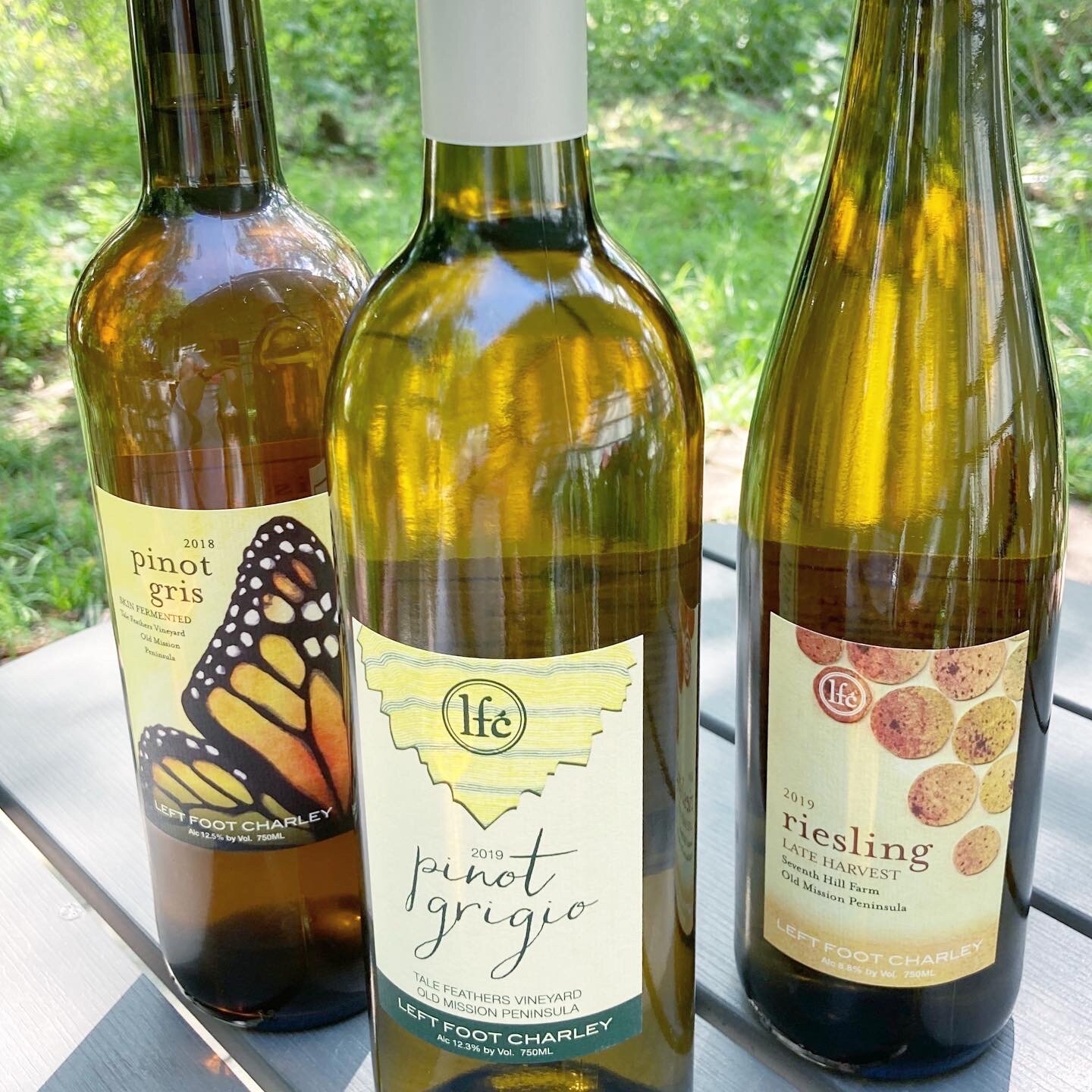
Recently, I began creating artwork for some of the bottles. It still feels totally surreal. The bottles above are the ones currently available that have my artwork on them. Though the skin fermented pinot gris on the left (my personal favorite label so far) has a very limited amount left! The ability to use my degree has been the best bonus I could ask for and truly an honor. I hope that LFC is able to use this artwork for years to come.
When I applied, I was simply looking for a paycheck. I somehow found a little family as well.
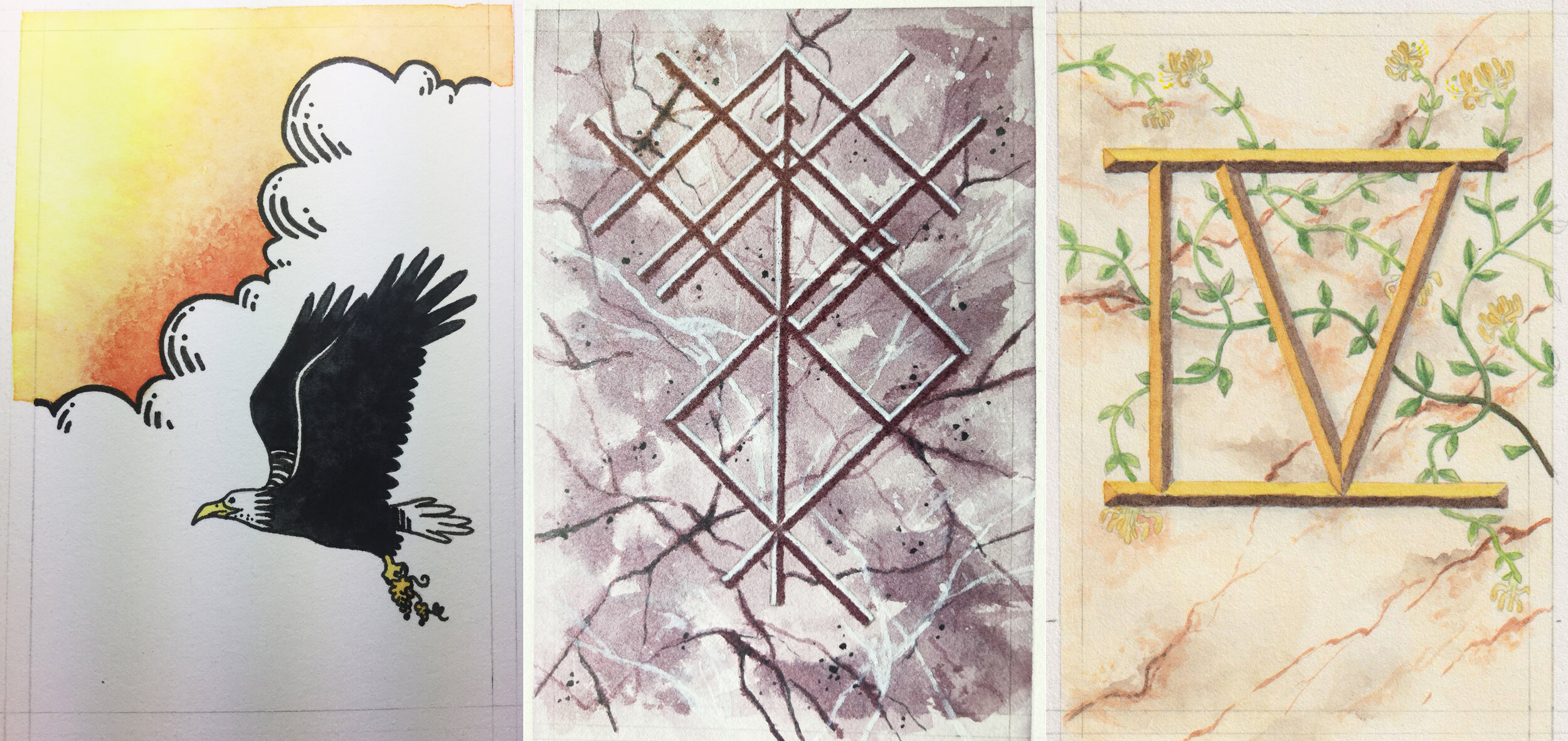
Artwork for upcoming labels: in order a riesling, blaufränkish, and pinot blanc.
An Inch of Whiskey
Some of the poems I gravitated towards because I thought they would be a good challenge due to their length—some were a full page, others just a few words. Still others had wonderful images in the text just begging to be depicted.
Read MoreReview: ArtGraf Watercolour Graphite
I’m not sure how I ended up being introduced to ArtGraf Watercolour Graphite (perhaps my brother, who is interested in calligraphy, brought it to my attention), but I’ve had a tin for a couple years. This is a very unusual product. As far as I know, it’s unique in the art materials market.
ArtGraf is a line of water-soluble graphite products from the Viarco company. According to the company’s website, watercolor graphite was discovered in 1990 by a meeting of minds between Viarco manager António José Vieira Araújo and painter Jose Emidio. But the products weren’t released until 2007. This article gives a little more information about the company and the discovery. And a little treat: here is the painter himself working with the tailor chalk version of the product!
From the Viarco website: “ArtGraf graphite watercolour is a revolutionary product that totally changes the artist’s relationship with graphite. Pencil painting is perhaps the best expression to define the artistic potential of this material, with which the user can obtain the full scale graphite shades, only with a brush and water. Possible to apply on different surfaces, fast drying, but with great capacity of correction, the ArtGraf watercolours are ground-breaking products.”
By the way, I am not endorsed by Viarco or receiving anything for this review.
Novice artists generally start out using graphite pencils to learn the basic principles of art. This is a very cool, topsy-turvy, almost Wonka-esque reinvention of this familiar medium. This watercolor graphite behaves almost like you imagine it should and retains some of the traditional graphite traits. I’m not sure how they suspend the ultrafine graphite particles, but I would assume some proprietary suspension agent like in pan watercolors.
I’ve used this a couple times for paintings such as “Ophelia.” So, it isn’t new to me, but I revisited it with a more critical eye.
Let’s dive into the details, shall we?
I “test drove” this on a piece of 400 series Strathmore watercolor paper. This paper is my go-to paper for painting. The Viarco blurb says that it can be used on a variety of surfaces. Thus far, I’ve only used it on this Strathmore paper and some artisanal 100% cotton watercolor paper from a local shop. I’m not sure that I would use it on anything other than watercolor paper. I think it’s just the nature of the beast when you’re working with something with a high water/liquid content. It could be added to other vehicles (oil or acrylic paints, for instance)…but that’s an experiment for another day.
I applied this to the paper in four ways: wet on wet, wet on dry, dry on dry, and dry on wet.
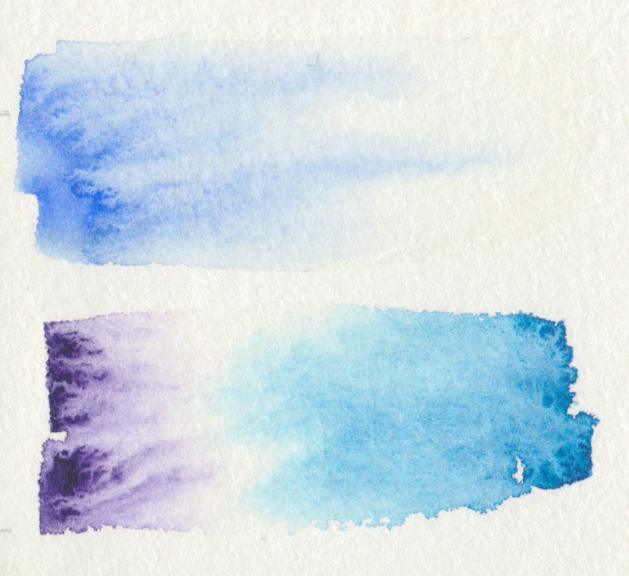
In wet on wet and wet on dry applications it performs very similarly to watercolor. The graphite is heavier than your usual watercolor pigment. It drifts beautifully in water, but doesn’t flow or bleed as much. So, those lovely formations that you get in watercolor occur here, but on a smaller scale. Wet on dry easily achieves very dense, opaque darks. I didn’t try dry brushing at all. Water is very quickly evaporated/absorbed in the tin. It helps to have a palette with wells when working with this product. When it’s watered down, it’s important to make sure that the graphite is well mixed before moving to paper as the graphite particles tend to settle.
Another thing to consider when working: it can be difficult to layer. Previous layers, even dry, tend to migrate when a wet layer is applied overtop. It’s not impossible, you just have to be careful and intentional.
In dry on dry applications it’s indistinguishable from powdered graphite. I scraped some out of the tin using a knife and then ground them into the paper with a brush. A blending stump, tortillion, or fingertip would also be perfect tools. It’s easy enough to move around, if messy. If you tend to work this way with traditional graphite, I’d suggest giving this a try and then experimenting with adding water by brush or perhaps spray bottle to complete/semi-complete pieces. I imagine some very cool effects could be achieved this way.
When dried, the graphite is still somewhat mobile. You can blend it out across your paper to some degree. If applied wet, some will be locked deeper into the body of the paper and not be able to pulled across the paper’s surface. That said, I achieved some wonderfully soft gradients using this method.
With this in mind, finished pieces do need to be protected with a spray fixative or they will smudge.
Dry on wet was something different all together. I’m not sure how I feel about it or sure how I would put this application into use. It would be difficult to control values. It probably would work best to add texture to darks or as an effect added to a finished piece.
In the second set of boxes I put the claim that it is “completely erasable” to the test. On the right half of each I tried to pull the graphite up. And I have to say, I wouldn’t consider this erasable. Application method and intensity greatly changes how removable it is. I tried two types of eraser and I had the best results with a kneadable eraser. Rolling it over the square rather than scrubbing and kneading the eraser often picked up the most graphite. The other eraser I used (Staedtler Mars plastic) did almost nothing. Actually, it seemed to grind it into the paper more and made it shiny. It would take a lot of effort to pull up the darkest values. Most likely, the paper would be ruined before the graphite came up sufficiently. Dry rubbed in graphite on dry paper came up fairly well, pretty similar to regular graphite, but there was still some staining.
I did some fun experiments as well by mixing some scrapings into ink and watercolor (both Winsor & Newton). I think in the future I would pick a watercolor without chalk in it. I think this made it too heavy. The far right square shows almost none of the flow that watercolor is known for. The ink seemed to behave more or less normally. In both cases, a darker ink or watercolor would be a better choice, but for illustration purposes yellow worked very well. I’m not sure what applications mixing the graphite into ink or watercolor would have for me personally, but who knows.
FINAL THOUGHTS:
I thoroughly enjoy this product. I would recommend it to anyone who enjoys watercolor. They operate on nearly the same principles. It intrigues me in the same way. It’s versatile, unusual, and challenging. It encourages experimentation and creativity. I really should pull this out more often. I feel like I’ve only discovered the tip of the iceberg as to what this is capable with this medium. I’m imagining stencils, layering over watercolor or ink, multimedia opportunities, pulling out ghostly shapes with eraser…the possibilities are endless! And unlike watercolor, which has a long, established tradition, this is a very new product and no rules about use/misuse.
I was also recently gifted the ArtGraf water-soluble Tailor Shapes in the primary colors. I hope to do a review of those as well.
If you enjoyed this review you may also like my reviews of the Sennelier Metal Pocket Set and Winsor & Newton Cotman Travel Set.
Look at how beautifully it bleeds!
Review: Sennelier French Artists' Watercolor Metal Pocket Set of 12 1/2 Pans
I seriously love everything about this set.
These paints are so incredibly smooth, fluid, and pigment rich. They are the luxury sedan of the watercolor paint world. There is no chalky or grittiness to any of the colors, they are made purely without fillers or an imbalance of components.
Read MoreReview: Winsor & Newton Cotman Travel Set
After using it for a few years, I do a thorough review of the Winsor & Newton Cotman travel set.
Read MoreMy Artistic Process: Sexy Demon-Girl
I talk about my new Sexy Girls series & walk you through the process of painting my latest piece.
Read MoreMy Artistic Process & Symbolism: Skyclad Witch Painting
PROCESS
I thought it might be nice to do a break down of how I work through a painting from concept to final product as well as explore the symbolism in a painting. I've already broken down the symbolism in the Grant Morrison piece on the latest episode of Chat-man & Robin, Episode 28.
I didn't get photos or video of the process of painting itself. I was feeling a little self conscious about this piece (still am), but I can walk through how I laid the paint & ink down.
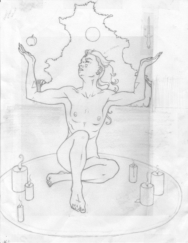
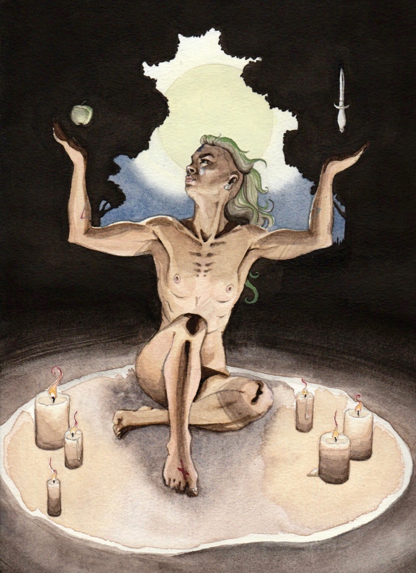
This rough sketch was drawn from a reference photo I took of myself. A few things were changed from the original photo, of course: longer, fuller hair, I evened out the level of the arms, left out my philtrum piercing & tattoos, made the drawing more cut & muscular...
You can see in this sketch I had a crescent moon on my forehead. I hadn't worked out the background imagery yet. Once I did, I swapped the crescent out for a rune
At this point I laid the horizon line & vanishing point down. I used the lines from my reference photo to find these. Maybe it's cheating, but it took way less time! Once those were in, I drew in the candles working over some roughly sketched in ones. Next came the sacred circle. When I was happy with these things I cleaned up my guides. Then I threw in the trees. Last came the athame, apple, & the moon.
The moon stayed this size all the way through transferring the drawing to watercolor paper (I do this using graphite paper—it's very hard to get up once it's down, so you'll notice a faint small moon inside the final). I felt the moon was too similar in size to the apple & athame, so I made it larger. It helped to add some drama to the piece, too, so it was a good choice.
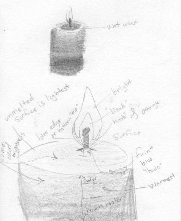
A candle study so I could better understand them.
How I worked when laying in the paint is I started with a pale yellow wash over areas I knew would have some of this showing: the candles, ground, sacred circle, the body, moon/sky, areas of the foliage. Then I worked on the candles while I was waiting to take a reference photo of myself to see how the candles' light would create shadows. (I realize as I write this that I didn't include shadows cast the pillar of the candle itself. Shit.) Then came the witch working light to dark skin tones, then details like hair color, lip color, the runes & alchemy symbols. I painted the apple & athame at the same time as the witch. The sky & ground came next. Next to last came the ink was of the trees & background. This actually took a good chunk of time. Finally, fine details on the witch like gouache highlights & painting in the moon with tinted gouache.
Symbolism
Like the Grant Morrison piece, I'm working in the same structures set up by existing religious (primarily Catholic) artwork. The arms raised by the witch were meant to be a harkening back to the Mother Mary's outstretched hands and also Justice personified. Balance, but also a calling down of the divine & of the feminine Moon. Her right foot is put forward in a symbolic placing of her foot upon the path of the spiritual journey.
Above her hands are an apple an an athame. I chose the athame first. Not only is it a common witch's tool, but I also used it to represent the phallic, the male. I needed another symbol to represent the female & what first came to mind was the apple. The apple is a very loaded symbol highly associated with the female & also with Eve, temptation, and knowledge. I was reading a short while before I chose this as my symbol in a book called Cunninham's Encyclopedia of Magical Herbs that I would highly recommend to anyone interested in herbology or green/hedge/kitchen witchcraft.
Some symbols are incorporated. They are symbols primarily of intention. Working top to bottom: on the witch's forehead is the rune beorc/berkanan that represents growth & rebirth. It's meant to represent the beginning of a new way of thinking. On her left cheek is the symbol of Mercury, an alchemical symbol associated with the masculine as well as mental processes & communication. On her right cheek I imagine is the symbol of Venus, associated with the feminine as well as the physical: love & sexuality. Note: everything is line with the witch's left/right. Again, I'm working with balance. The balancing of the spiritual & the divine. On her arms are more alchemical symbols. These ones are or fire (left) & water (right). (Another realization as I look back at this...I accidentally reversed these symbols. They should be swapped to keep with the left/masculine & right/masculine side of the image.) Again, fire equals male, water equals female. On her extended foot is the last symbol, the rune nyd/naudiz that represents need, craving, or a desire. As mentioned above this is in reference to the spiritual journey.
Three candles to a side are balance again. Also the number six is associated with the artist, responsibility, balance, generosity/humanitarianism & being community-oriented. All wonderful things to call into an act of dedication to witchcraft. Green, present in the witch's hair and the apple is associated with prosperity & fertility—in this case meant metaphorically in relation to her growing powers & budding spirituality. The plug seen in her earlobe is meant to be a moonstone, used for fertility as well as for spiritual growth, protection, & amplifying intuition.


